Define meaningful measures
Agree the business questions, calculations and reporting periods that matter. Clarify what is included in each measure so teams can interpret it consistently.

Management Information & Analytics · Zimbabwe
Make your business information easier to understand.
Bring agreed measures and operational records into dashboards that help managers explore performance and decide where to focus.
The business need
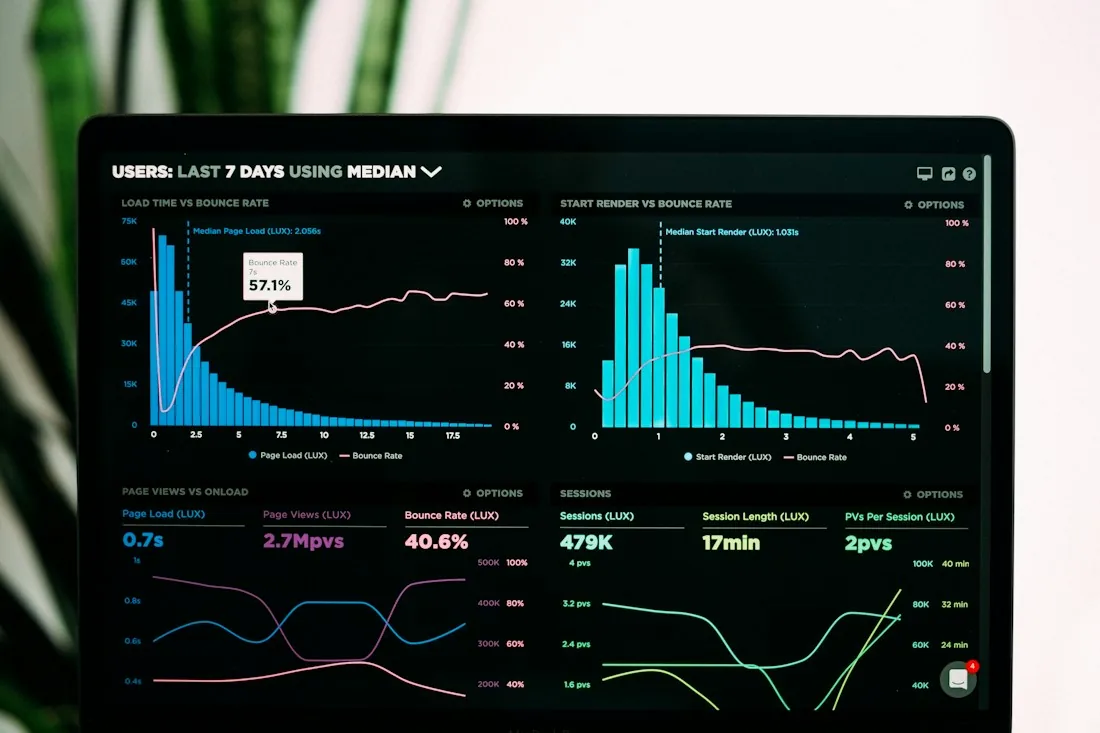
Managers need to know what a number represents before they can act on it. Africube’s analytics service starts with the decisions your team makes and the records available to support them. We define measures, review the source data and design views that make patterns and differences easier to explore. A useful dashboard connects a summary to the detail behind it, with reporting periods, filters and definitions that fit the way your organisation works.
Scope & capabilities
Agree the business questions, calculations and reporting periods that matter. Clarify what is included in each measure so teams can interpret it consistently.
Assess available records and the work needed to make them usable. Review differences in formats, identifiers and completeness before combining information for analysis.
Create views around a defined audience and decision. Use appropriate summaries, comparisons and visualisations so the most relevant information has a clear place.
Scope filters and supporting views that help users investigate a result. The available level of detail depends on the source records and the access agreed for the project.
Review calculations and sample results with people who understand the operation. Record definitions and source assumptions alongside the agreed dashboard behaviour.
The approach
A typical workflow, aligned to the agreed scope and configuration.
Identify the questions managers need the dashboard to answer.
Assess sources, quality and the definitions behind each measure.
Build useful views and check sample results with your team.
Explain how to use the views and interpret the agreed measures.
Project outputs
A shared explanation of the calculations, reporting periods and source assumptions.
The management summaries, comparisons and supporting detail agreed for your users.
Guidance on sources, refresh arrangements and interpreting the dashboard correctly.
Before we scope the work
The dashboard scope depends on your business questions, source data and intended audience. Agree the measures, filters, level of detail, access requirements and refresh frequency with Africube. The delivery tools and any connections to source systems are selected for the assessed environment.
Useful answers
A dashboard supports exploration: users compare measures, change filters and inspect detail where included. An automated report prepares a defined output on a schedule or request. Africube can scope either approach, or both, around how the information will be used.
Yes, spreadsheets can be assessed as a source. Their structure, consistency and update process determine the preparation needed. Bring a representative example and explain who maintains it and how often it changes.
Agree definitions before designing the final views. Africube works through calculations and sample results with your team so the dashboard reflects the intended business meaning and makes relevant assumptions clear.
Related solutions
These offerings address related needs. Any connection between systems is assessed and scoped separately.
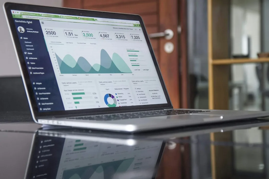
Business Reporting Automation
Turn an agreed reporting requirement into a defined process for preparing, formatting and delivering business information.
Explore solution
Accounting System Integration
Scope connections around your Sage Evolution environment, from access to operational records through reporting and specialised business workflows.
Explore solution
Inventory & Warehouse Management
Connect purchasing, receiving, warehouse movements and stock reporting in an inventory management system for Zimbabwean businesses.
Explore solution
Field Sales, Van Sales & Distribution Management
Manage field sales, customer coverage and distribution from vehicle loading to route reconciliation.
Explore solutionYour next step
Tell us what you use today, what needs to work better and where you want to go.